Game Beacon Responsive Website
CASE STUDY (For educational purposes only)
Overview
The Problem
Looking for a way to access and read about upcoming video games without having to search all over the web.
The Goal
Design a website that can congregate information about websites and offer a forum for discussions.
My Role and Responsibilities
ROLE: UX designer designing an payment app from conception to delivery.
RESPONSIBILITIES: Paper and digital wireframing, low and high-fidelity prototyping, conducting usability studies, accounting for accessibility, and iterating on designs.
Research
Summary
I conducted interviews and created empathy maps to understand the users I’m designing for and their needs.
A primary user group identified through research was working adults who enjoy video games, but also have busy schedules.
Pain Points
Information Not Centralized and Accessible - Often have to search multiple sites for information pertaining to one game.
No Accessible Record of Favorite Games - Not many options to have a list of frequently searched games.
Persona
Jenna leads a busy work life as a Marketing Director for a medium-sized company in the Big Apple. She likes to unwind in her free time by playing video games and looking out for new releases. She has been taking on more projects at work recently, and as a result, been working nights to stay on top. When she gets home, she is often too tired to check for new game releases or remember games she has been waiting for.
GOALS
Lead and expand her team through multiple successful projects
Begin learning about video game development and earn certification
Travel the world with her pets
FRUSTRATIONS
“I often like to look for news about upcoming games. However, with working long nights recently, I come home too tired to search out anything.”
“I wish there was a way to find all future releases in one place without having to go to multiple sites.”
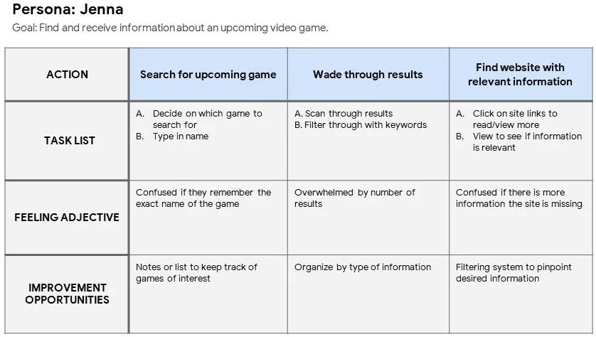
Journey Map
Mapping Jenna’s user journey was really helpful in understanding her feelings and wants when trying to keep track of upcoming video games she is interested in, and how a website can improve the experience.
Ideation
Sitemap
Mapping Jenna’s user journey was really helpful in understanding her feelings and wants when trying to keep track of upcoming video games she is interested in, and how a website can improve the experience.
Paper Wireframes
Took some time to iterate on some wireframes on paper to figure out a proper layout.
Most of the iterations from the first paper sketch seemed appropriate and were starred to be brought into the digital wireframes.
Usability Study: Findings
ROUND 1 FINDINGS
Users didn’t understand “Add to Game List”
Users think text and images can be sized down to fit more above the fold
Some users couldn’t find a way to sign out
ROUND 2 FINDINGS
Color added to icons when triggered would help with flow
Responsive design will help when accessing from a mobile device
Before and After Usability Study
During the usability test, users were unsure what “Your Games Lists” meant. To remove any confusion, it was changed to “Favorites.”
Solution
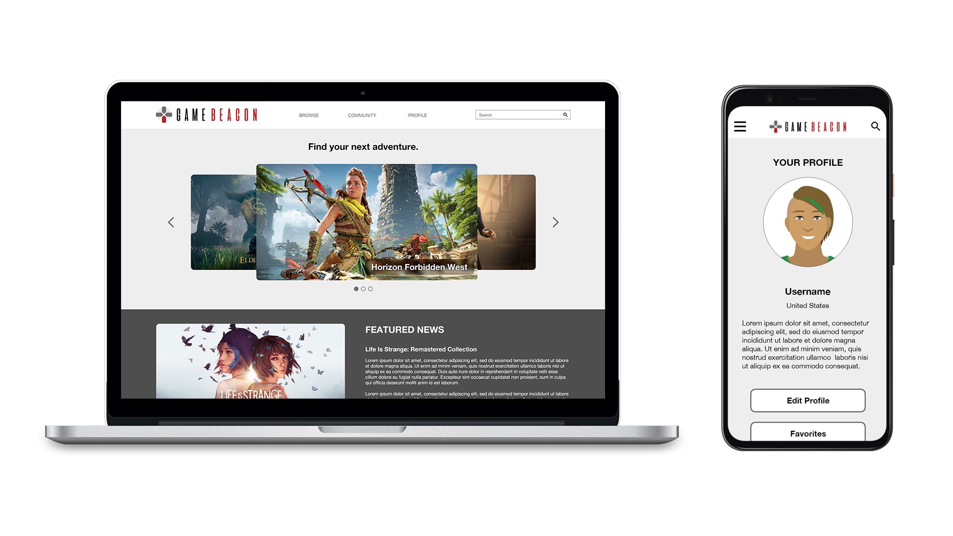
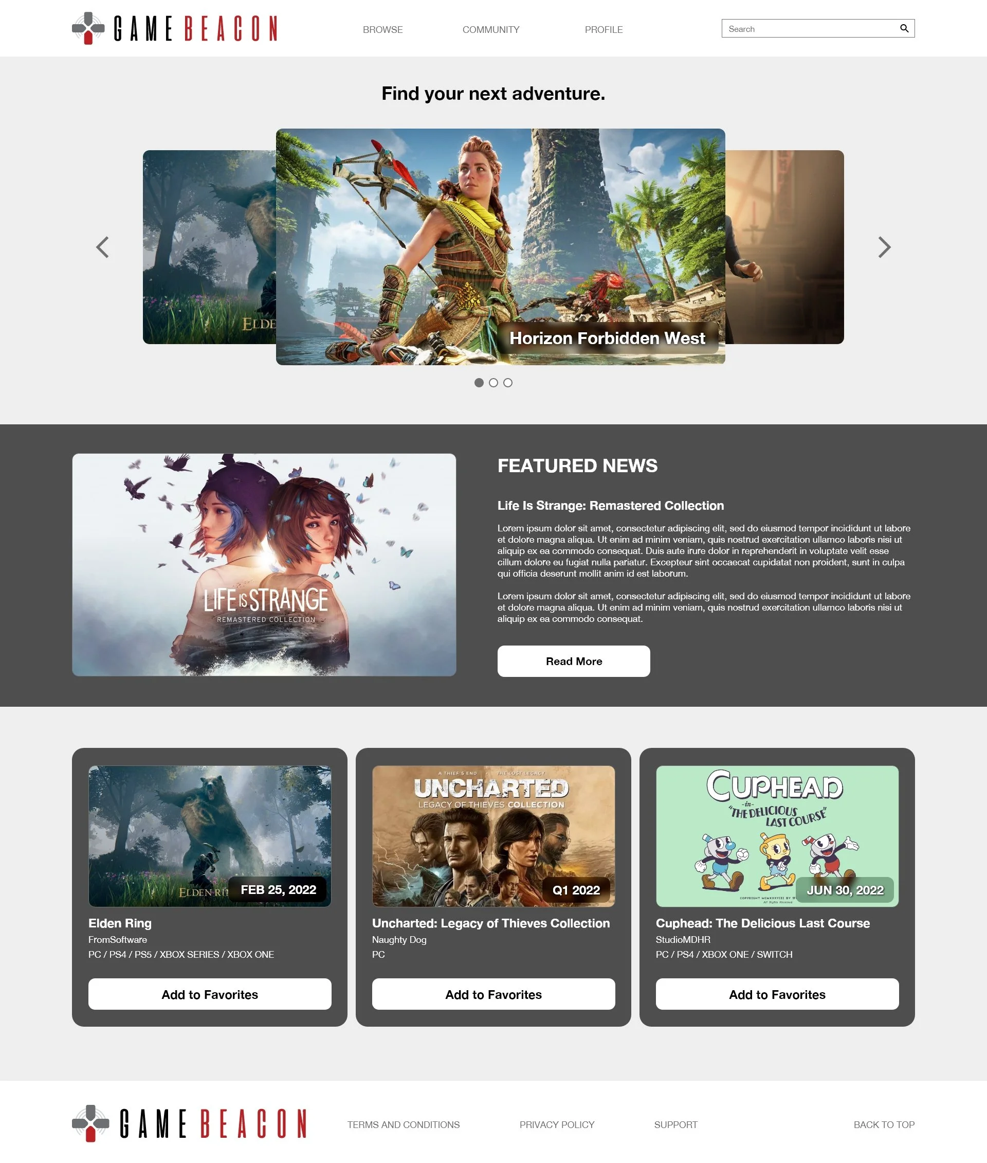
High-Fidelity Mockup (Desktop)
High-Fidelity Mockup (Mobile)
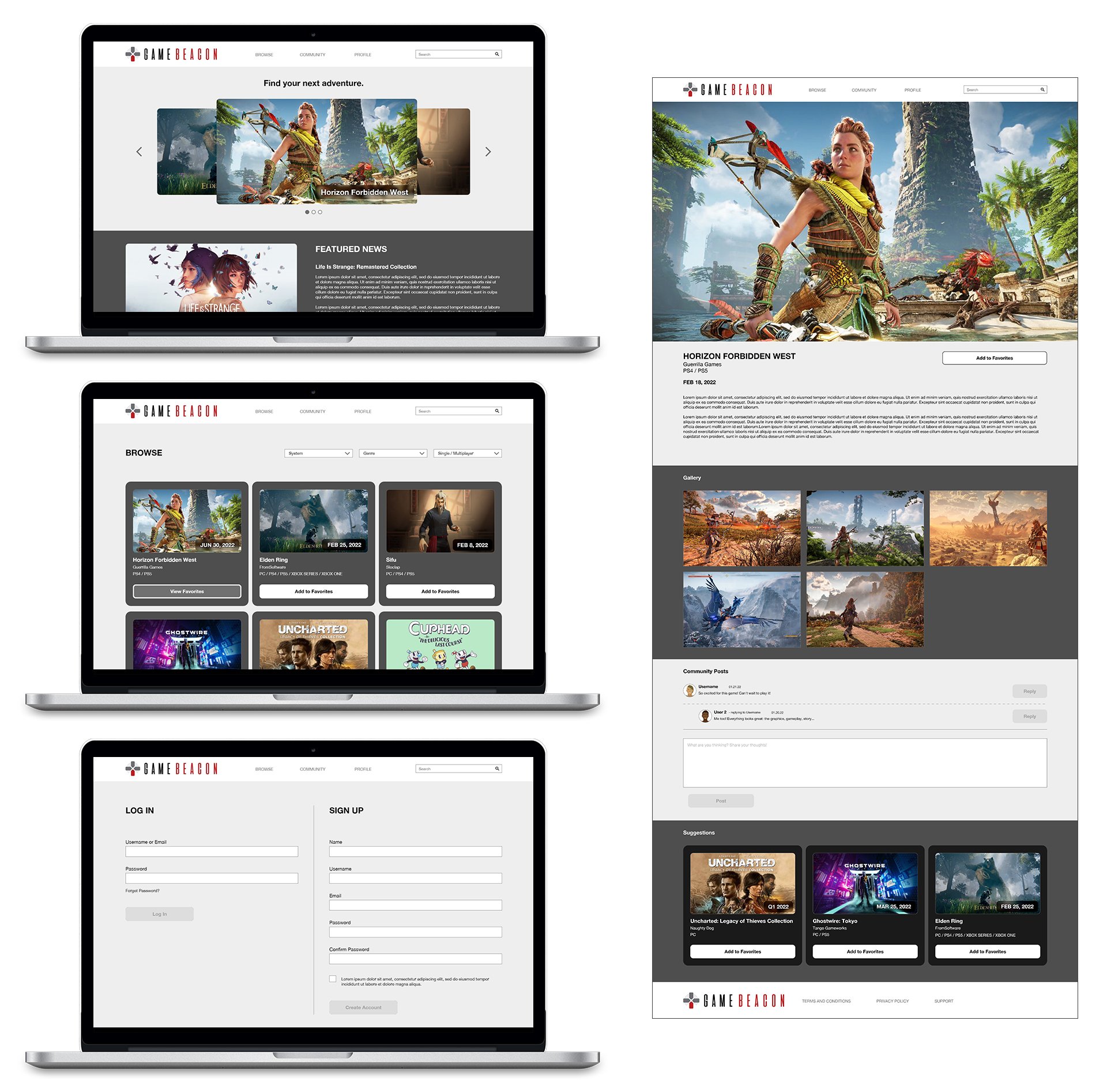
High-Fidelity Prototype
Lessons and Going Forward
Impact
The website makes users feel more organized and informed on upcoming games.
“I like how I can add games to a growing list that I can always go back to later.”
What I Learned
While designing the app, I learned that usability studies are beneficial to gain new perspectives from different users. A small detail such as having the same button designs really helps take the app farther.
Next Steps
Conduct another round of usability studies to conclude whether previous pain points were addressed and resolved, and if new pain points arose.
Refine designs and include more accessibility considerations. Then conduct more user research to validate whether changes are helpful or creates new pain points.


