HealthEats App and Responsive Website
CASE STUDY (For educational purposes only)
Overview
The Problem
Those with busy schedules have little time to prepare a meal for dinner, and often resort to purchasing takeout (which is unhealthy).
The Goal
Design an app and website that work in continuity to easily access healthy simple recipes with minimal prep times.
My Role and Responsibilities
ROLE: UX designer designing an payment app from conception to delivery.
RESPONSIBILITIES: Paper and digital wireframing, low and high-fidelity prototyping, conducting usability studies, accounting for accessibility, and iterating on designs.
Research
Summary
I conducted interviews and created empathy maps to understand the users I’m designing for and their needs.
A primary user group identified through research were working adults who are seeking to eat healthier with easy-and quick-to-prep recipes.
Pain Points
Limited time leading to fastest option(s) - With a busy schedule, users often times resort to fast food or takeout (which is not often healthy).
Remembering what ingredients to get - Lost in their busy schedules, users can forget what ingredients are needed to prep their meals.
No way to find recipe without re-searching - No way to save recipes without spending more time to look for them again.
Persona
Kai is a construction worker who works long hours. They acknowledge that they should start living a healthier routine. However, they barely have time or the resources to eat healthy during work hours, resulting in purchasing fast food and/or takeout. When Kai does get home from work, they are often too tired or do not have enough time to prep and cook a meal.
GOALS
Save enough to afford a house
Complete some certifications to move into a new field of work
Work out and eating healthier
FRUSTRATIONS
“Working most of the day on-site without a fridge, most of my meals are fast food or take out.”
“After coming home from work, I’m either too tired or do not have enough time to prep a meal.”
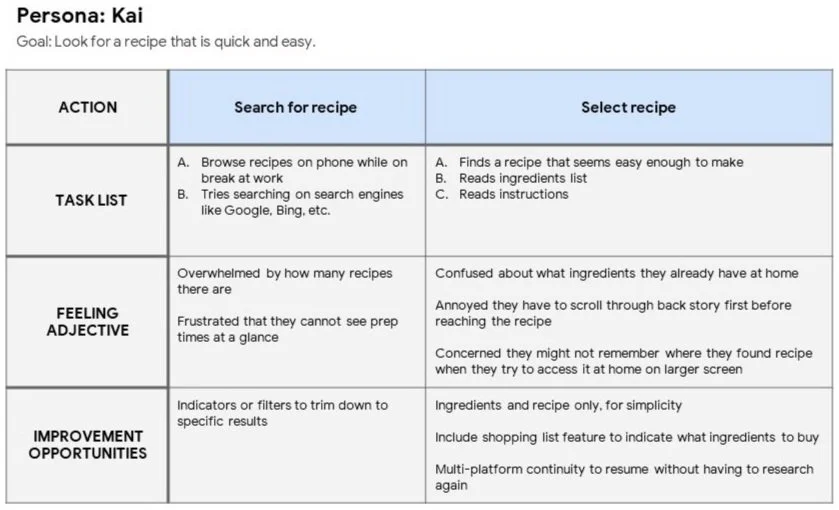
Journey Map
Mapping Kai’s user journey was really helpful in understanding their feelings and wants when trying to search for a recipe to make at home after work.
Ideation
Sitemap
Developing website navigation proved to be a bit difficult; luckily, creating a sitemap helped organize thoughts and direction.
The main goal for the sitemap was to help organize what pages and its contents would belong in which groups.
Paper Wireframes
Took some time to iterate on some wireframes on paper to figure out a proper layout.
Most of the iterations from the first paper sketch seemed appropriate and were starred to be brought into the digital wireframes.
Digital Wireframes
I’ve used Adobe Xd to create the digital wireframes for this project.
Usability Study: Findings
ROUND 1 FINDINGS
Categories could be more specific (like by ingredients, etc.)
Users lost their place when they accidentally clicked Home button
When adding ingredients to Shopping List, might be more beneficial to add ingredients individually
ROUND 2 FINDINGS
Color and icons should be more streamlined, consistent
Rounded corners or consistent shapes on buttons would be less jarring
Before and After Usability Study
During the usability test when users accidentally hit the logo, it directed them to the home page and made them lost their place. To remedy this, an overlay is triggered prompting the users to confirm whether they wish to proceed to the home page or not.
Solution
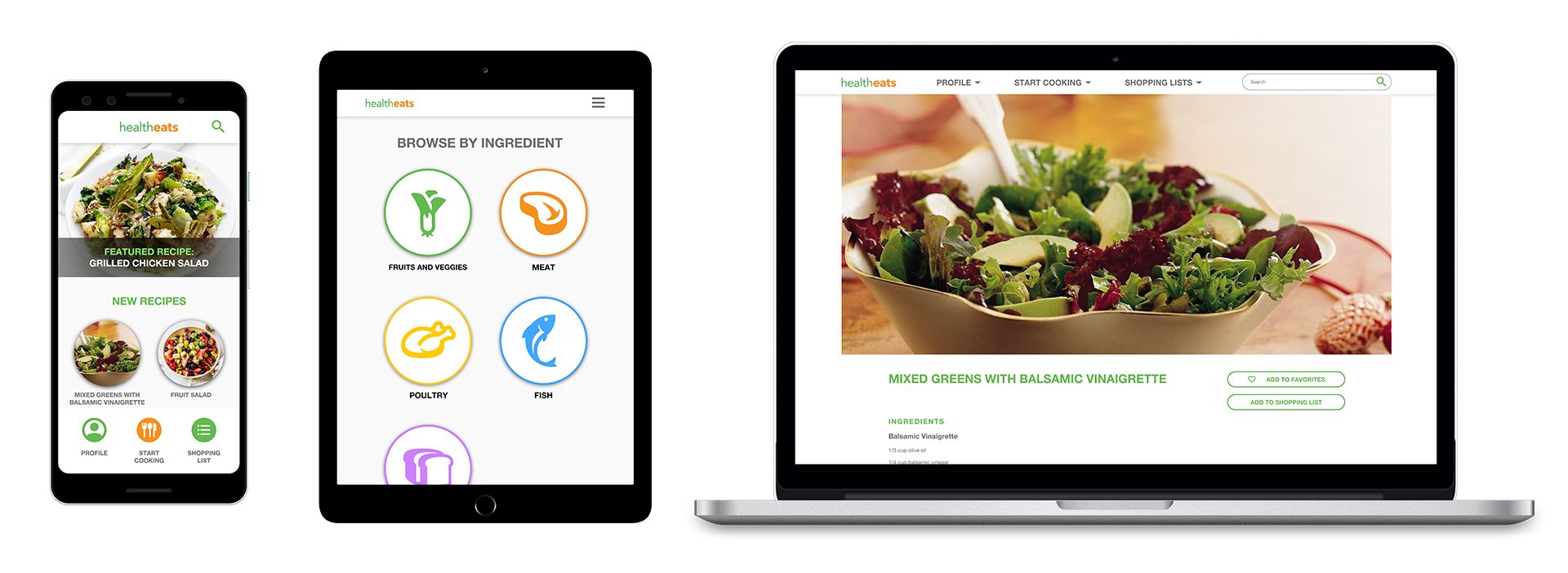
High-Fidelity Mockup (App)
High-Fidelity Mockup (Responsive Website)
High-Fidelity Prototype
Lessons and Going Forward
Impact
The website helps busy users find recipes on the go, and then continue their shopping and cooking through multiple platforms.
“I like how the recipes do include prep time as a category, so I wouldn’t be in for a surprise.”
What I Learned
While designing the website, I learned that usability studies are beneficial to gain new perspectives from different users. A small detail such as having the same button designs really helps keep the user engaged and focused.
Next Steps
Conduct another round of usability studies to conclude whether previous pain points were addressed and resolved, and if new pain points arose.
Refine designs and include more accessibility considerations. Then conduct more user research to validate whether changes are helpful or creates new pain points.


