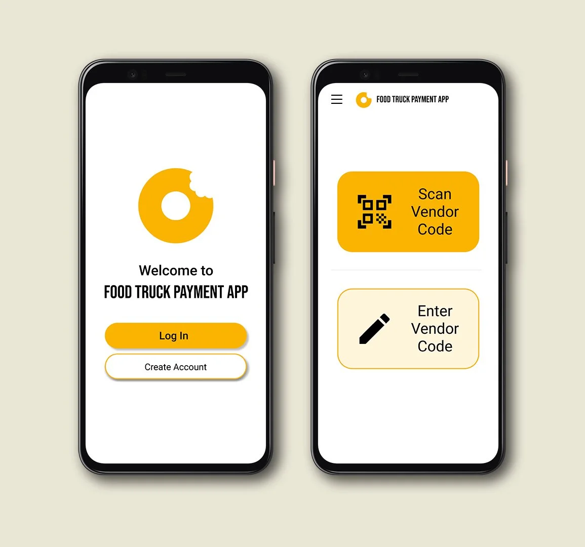
Food Truck Payment App
CASE STUDY (For educational purposes only)
Overview
The Problem
Looking to pay for a meal from a mobile vendor digitally without the fear of exchanging germs or not having enough cash.
The Goal
Design an app that allows users to easily pay for their meals through contactless digital currency.
My Role and Responsibilities
Role: UX designer designing an payment app from conception to delivery.
Responsibilities: Paper and digital wireframing, low and high-fidelity prototyping, conducting usability studies, accounting for accessibility, and iterating on designs.
Research
Summary
I conducted interviews and created empathy maps to understand the users I’m designing for and their needs.
A primary user group identified through research was working adults who have busy schedules and purchased meals from food trucks or mobile vendors at least once a week.
Pain Points
Limited Accepted Currency - Food trucks and mobile vendors usually only accept cash, often limiting potential customers.
Health-Conscious - During a pandemic, more consumers are aware of viruses and germs, and are looking for ways to reduce spread and transfer.
Persona
Michael is a busy college student and intern at an accounting firm who needs a safe and fast way to pay for lunch from a food truck because they would like to minimize the spread of COVID while needing to eat during their busy schedule.
GOALS
Demonstrate his abilities and turn an internship into an apprenticeship or full-time job.
Complete CPA soon after graduating to reach next levels
FRUSTRATIONS
“Between classes and work, I do not have a lot of time to grab food. I always stop by food trucks to get a quick bite.”
“I live with my parents and while they’re not sick, their health is a main concern (especially during the pandemic).
Journey Map
Mapping Michael’s user journey was really helpful in understanding his feelings and wants when ordering food from a food truck, and how an app can improve the experience.
Ideation
Paper Wireframes
Took some time to iterate on some wireframes on paper to figure out a proper layout.
An initial design for call-to-actions incorporated large individual icons. However, standalone icons can be misinterpreted and/or unidentifiable. I then decided to add accompanying text for the user to more easily identify the action buttons.
Digital Wireframes
After ideating some layouts on paper, I used Figma to construct digital wireframes.
Usability Study: Findings
ROUND 1 FINDINGS
Users had trouble linking new forms of payment
Users had trouble continuing through the payment app
Users want more security in the app
ROUND 2 FINDINGS
When selecting payment, have “Default Payment” option set
Users were able to complete payment faster with buttons being more consistent and explicitly labeled
Before and After Usability Study
MENU AND PROFILE
While participants did not make any comments regarding the Profile and Menu pages, I consolidated the two into the Menu page to reduce clicks required to complete an action.
ACTION BUTTONS
Participants had difficulty navigating the payment process because they were unable to locate the action buttons to complete their tasks. In this case, the Continue and Back buttons were made more prominent and directly under the Vendor Code input
In this screen, the “check” button was replaced with the consistent gold “Continue” button to confirm the payment amount.
Solution
High-Fidelity Mockup
The high-fidelity prototype presents a more straight-forward payment process. Links to other pages are all accessible on one page.
High-Fidelity Prototype
Lessons and Going Forward
Impact
The app makes users feel more at ease when they are looking to order from their favorite food truck.
“I do see myself using this app. It’s very intuitive and straight-forward.”
What I Learned
While designing the app, I learned that usability studies are beneficial to gain new perspectives from different users. A small detail such as having the same button designs really helps take the app farther.
Next Steps
Conduct another round of usability studies to conclude whether previous pain points were addressed and resolved, and if new pain points arose.
Refine designs and include more accessibility considerations. Then conduct more user research to validate whether changes are helpful or creates new pain points.


